Elevating Minnesota CPAs
Revealing the new MNCPA logo
| April/May 2022 Footnote
Editor's note: Updated April 1, 2022
Good news: We have a new coat of paint — and we’re thrilled to share why and how.
After more than 30 years since our last logo redesign, we decided to refresh and strengthen our brand with one that reflects the growing changes of today’s financial landscape as well as our resiliency, innovation, values and creativity. We wanted to showcase our organization’s longevity, experience and adaptability with a fresh perspective for how we present ourselves and connect with members. And most importantly, we wanted a logo that lets members know they belong. The MNCPA is a community dedicated to lifelong learning that welcomes the knowledge, skills and viewpoints of all.
In the coming months, you’ll also see other visual tweaks, including on the website, in our mailings and emails, and right here in Footnote. The MNCPA remains a strong, reputable brand, and these changes will help position the organization for continued success working on behalf of and with Minnesota CPAs, and in the eyes of the public.
The process
During our rebranding, we worked with the MNCPA board of directors, members and a creative agency to complete this reimagining. Together, we identified key differentiators and attributes that created the foundation of our refreshed brand and highlighted the evolution from who we were to where we want to be. Our defined attributes of knowledge, community, excellence and advocacy serve as our guiding principles for what we do every day to lead the industry forward.
The logo
The new MNCPA logo features our acronym in lowercase, curved letters in a clean typeface. This gives it a modern, approachable and welcoming feel. The arrow icon is a callback to the trees from our previous logo. This added element represents the upward momentum and success that results from working together toward a common goal, a key component of our values. It also dovetails nicely with our new tagline, “Elevate your impact.”
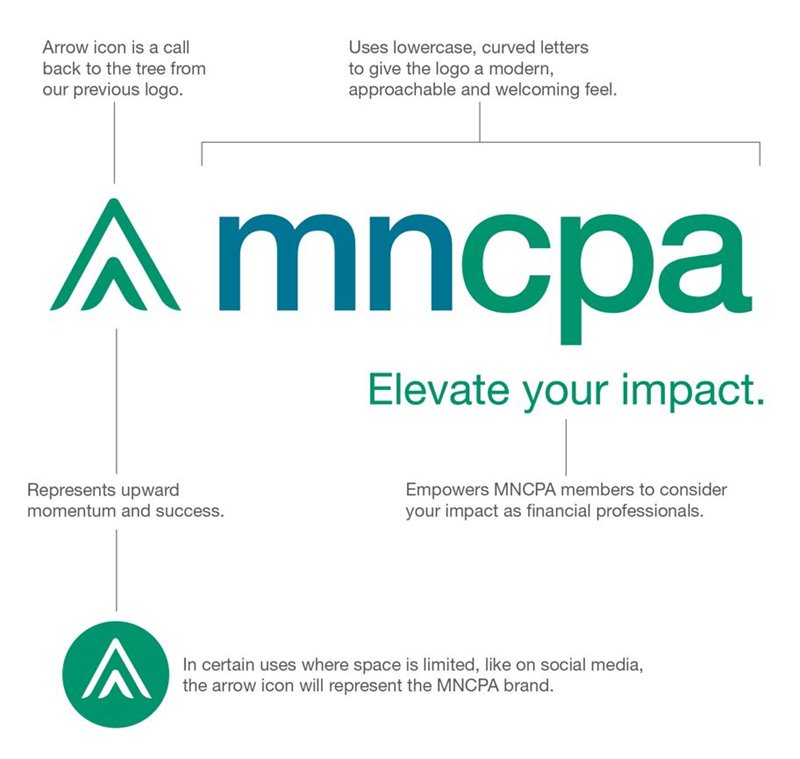
The tagline
Elevate your impact reflects the value we bring to members who want to make a difference. It invites members — current and potential — to consider your roles in how you not only represent the MNCPA externally but also how you perceive yourselves as financial professionals as you grow your career. Known for excellence and knowledge, we want the MNCPA to continue to be perceived as a trusted, well-respected organization for decades to come.
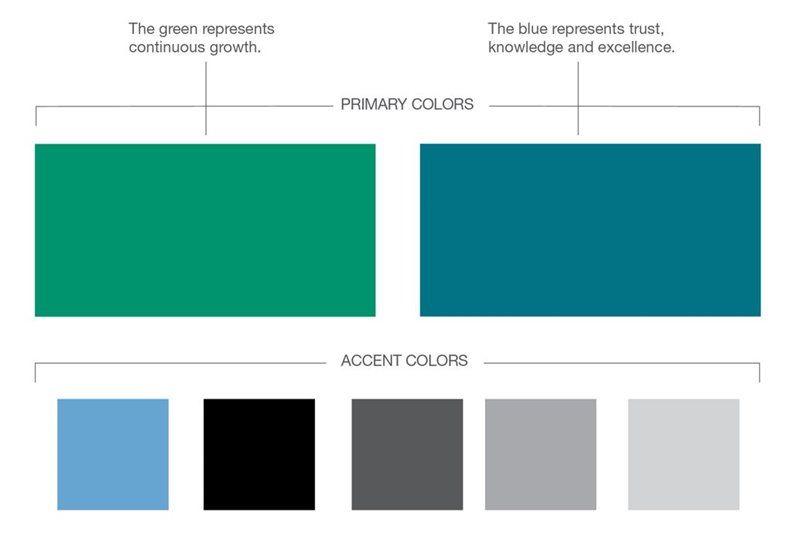
The colors
We bridged the gap between the original green and blue colors of our palette by giving them a modern twist. These colors still represent the core facets of our brand: The green represents our continuous growth while the blue connotes trust, knowledge and excellence. These colors also symbolize the trees and water of Minnesota, serving as a connection to our community and our commitment to the people in the regions we serve.
Want to use the logo for your materials?
Visit
www.mncpa.org/logo to download logos and read how you may use them.